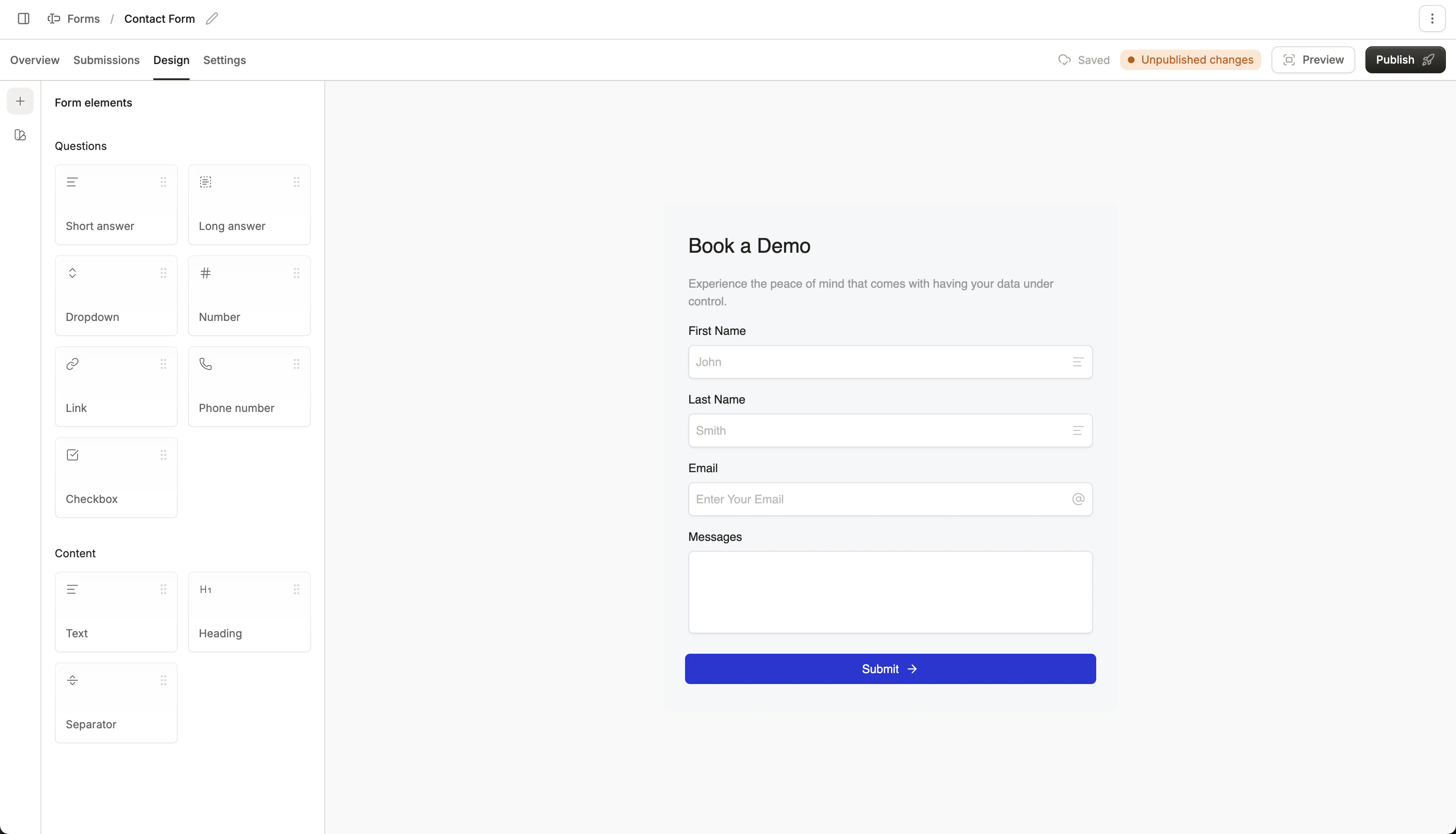
Design Conversion embedded forms with the forms builder, found under the Design tab.
On the left thin sidebar, you can access the form element library. Drag in useful elements like a “short answer” input field, checkbox, and text blocks to design your form!
To change colors and fonts for your input fields, go to the “Form theme”
Email field
By default, the “Email” input is populated when you create a new Conversion form. This field cannot be removed, as email address is required for all forms.
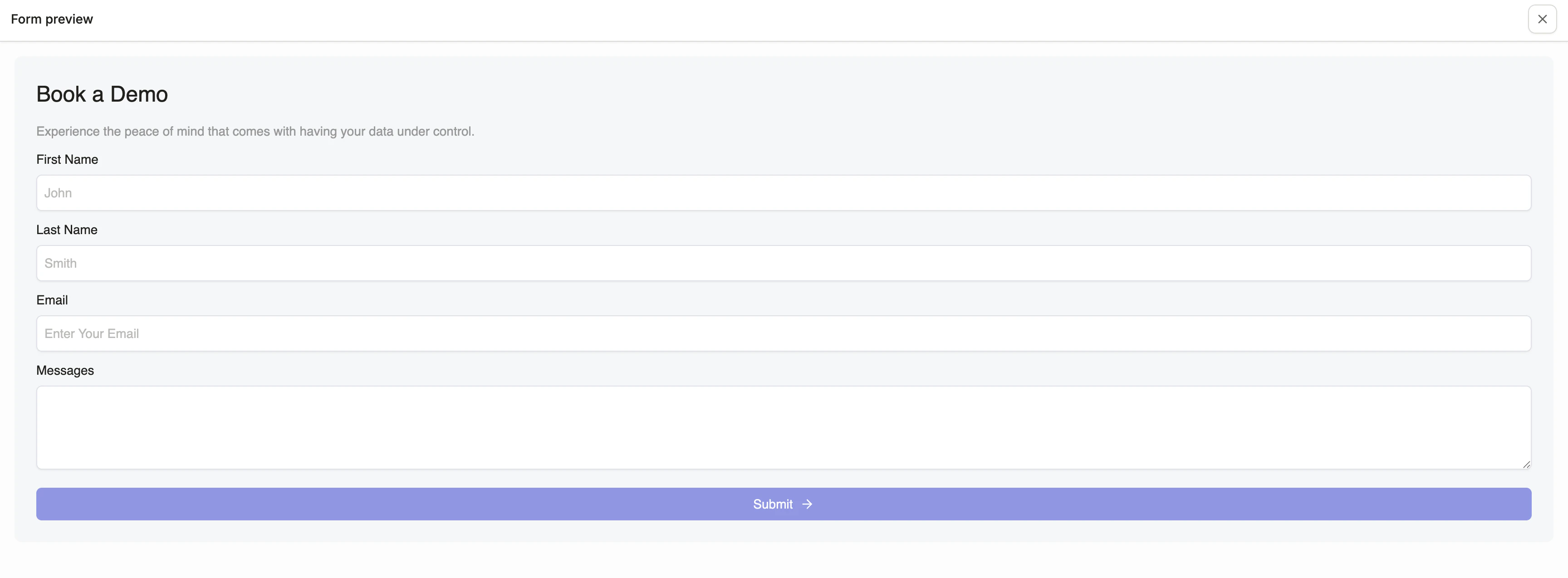
Previewing
You can always preview your design by clicking “Preview” in the top right. This renders the form as it would display on your website, and it will display validation errors properly.
Publishing
You can publish the form live by clicking “Publish” in the top right. This will instantly publish any changes to your form live.
It may take up to a minute or two to see the changes reflect on your website. Conversion uses CDN caching to optimize form load performance.